Monday 25 January 2016

Cedric Delsaux Research


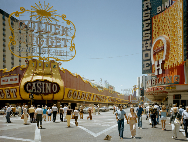
Cedric Delsaux is a French photographer born in 1974. He originally studied literature and cinema before turning to photography. Possibly his most popular series is 'Dark Lens', which features characters from Star Wars placed in real images blurs the line between fantasy and reality creating a post-apocalyptic feeling to his work. Although the images appear so realistic, we know that they are manipulated images as we know that the characters are fictional. 1784 is another series that Delsaux created which he describes as 'like a maze with no beginning and no end, at the same time totally real and absolutely false, a theatre stage, film set, haunting music, a wonder, 1784 is a random tale, just like a reflection of our lives.' In this series he collides past and present rather than fictional and reality. Below are some images from his 'Dark Lens' series.


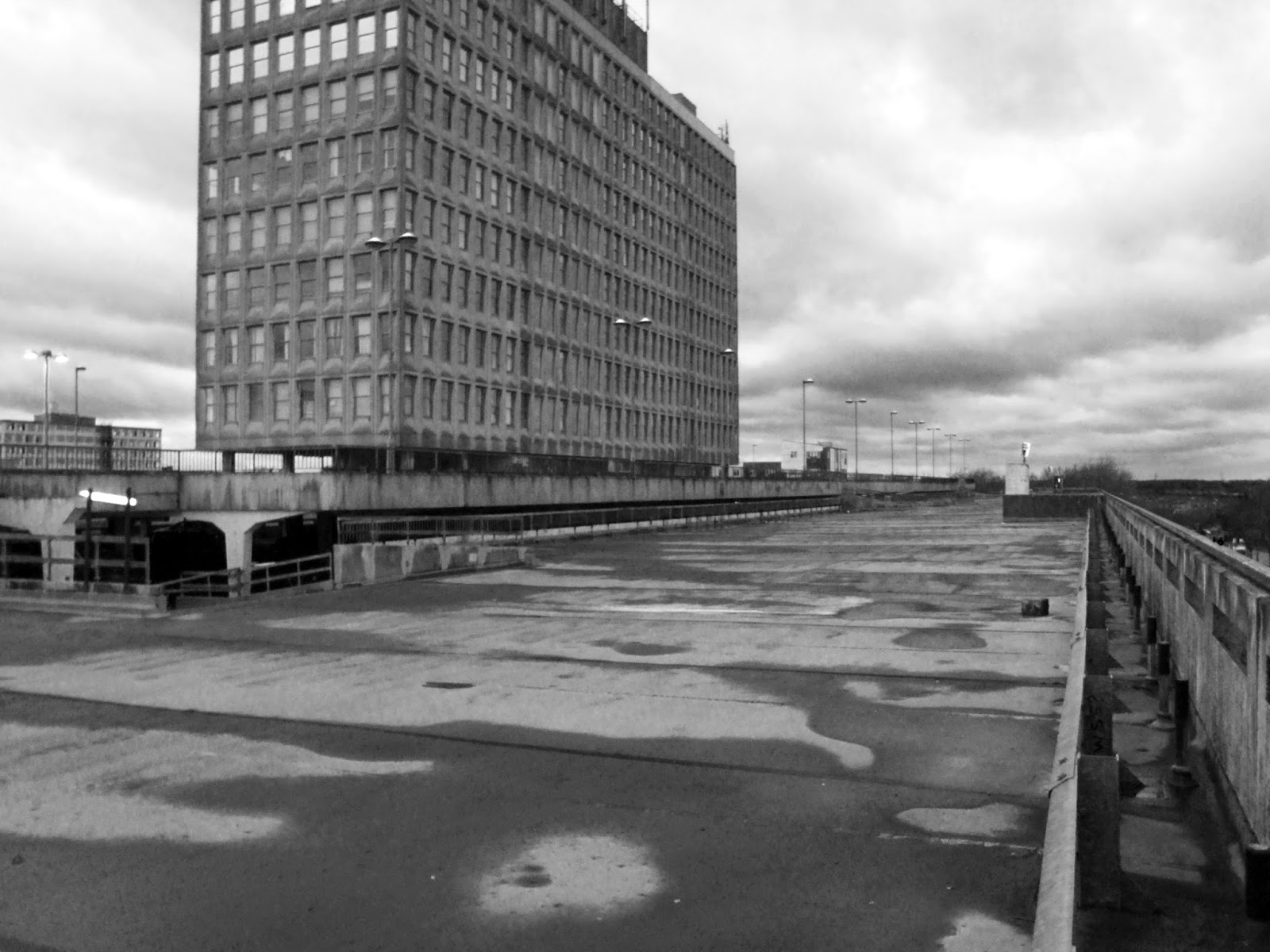
I like this image due to the high contrast in colour between the characters and the background. Both the sky and the roof are dull, de-saturated grey tones which make the image seem dreary and unappealing, but with the addition of the characters it makes the image pop due to the brightness of their clothing. The red colour could connote danger or blood.


I like this image as it is a true representation of how Cedric Delsaux pulls together fantasy and reality. On the far side of the image we can see a city full of skyscraper buildings with bright lights. Towards the front, however, we see a droid army in a desert-like location which is almost the complete opposite. Although the two locations are so different, it seems to fit in the image.


This image is a more subtle example of his Star Wars/reality work. Instead of featuring characters from the film, it features a prop - the lightsaber. Whilst it is not as obvious as the other pictures, it still works really well as part of his image due to the fact that the landscape is quite dark and the lightsaber is so bright. The way that the grass around it has turned red makes it look completely natural.

Landscape - Straight Image


Landscape - Contact Sheet


Landscape - Work Diary

In todays session we were tasked with taking pictures of landscapes. Whilst I found this task easy to understand and knew exactly what I had to do, I found it difficult to take pictures of landscapes in my surroundings due to it being an urban area with lots of buildings. I still did manage to take a few images that I liked and I edited these in Photoshop to be black and white as I tried to make my work look as though it was inspired by the photographer Ansel Adams. Below is an image I liked and one I did not like.


This was my favourite image from the shoot as I believe it is the best representation of a landscape that I took. I also liked how, due to the puddles on the floor, it has created contrasting tones which I manipulated in Photoshop to appear even more contrasting. I did this as high tonal contrast is a clear theme in Ansel Adams work.


This was an image I did not like. I took this image as I was attempting to get a picture of the road. I wanted it to be a clear road and I wanted it to be completely straight across the middle as this would create perfectly horizontal lines. This did not work for two reasons. The first is that I took the image at an angle and so the lines are not horizontal but are slanted, and secondly you can see a car enter the image in the bottom right corner.

Progression

When I next shoot landscape photography, I would try and follow the work of a different photographer such as Stephen Shore as I found it hard to do this with Ansel Adams. This is because I am in an urban landscape whilst Ansel Adams shot images of natural landscapes. I would also try to take more pictures as due to the setting I was in and the weather I was restricted with time and did not manage to take many.


Landscape - Image Bank


I like this image due to the vibrance of the colours compared to the pure white of the waterfall. The face that the grass is such a bright green and the orange of the cliff is so strong makes it seem slightly artificial and shows you how wonderful nature can be.


I like how this images only uses three colours but is still such an interesting photo. The bright yellow of the flowers and the blue of the sky makes the tree in the centre of the image stand out much more. It almost seems lonely as it is such a wide landscape yet it is the only tree in the area.


The use of reflection in this image makes it almost seem manipulated due to how clear it is on the surface of the river. This reflection creates a full circle in the centre of the image, which is clearly the focal point. What also makes this area the focal point is that there is a white light shining on the surface of the river, standing out against the dark greens and browns.


The use of different tones of blue in this image makes is stand out so much more as it all fits to one theme rather than appearing to have different colours thrown together. Due to most of the colours being quite dark, it makes the fog pop as it appears to be so light. This is immediately what your eyesight is drawn towards as this is the part of the image that stands out the most.


The leading lines in this image of the plants immediately bring your eyesight to the horizon, but I don't believe that this is the focal point of the image which is why I like this image. I like how, although the focal point should mostly be where the leading lines take you, I believe the actual rows of plants to be the focus point due to the bright greens and purples and the darkness in between each row compared to the pastel colours of the sky.

Thursday 21 January 2016

Landscape - Definiton

Landscape: a region or part of a town, a country or the world.

Landscape photography is one of the most popular genres of photography. Artists include Ansel Adams, Stephen Shore and Peter Watson. Below are examples of each of these photographers works.


Ansel Adams


Stephen Shore


Peter Watson

Thursday 14 January 2016

Stephen Shore Research


Stephen Shore is a photographer born in New York City, USA (October 8, 1947). Shore is well known for his landscape imagery and for pioneering use of colour in art photography. Shore's career started from an early age of fourteen, when he presented his photographs to Edward Steichen, the curator of photography at the Museum of Modern Art. Then, at age 24, he became the second photographer ever to have an exhibition at the Metropolitan Museum of Art. Not only did Shore take images of landscapes, but also took fashion images for Another Magazine, Elle, The Daily Telegraph, Urban Outfitters and others. Below are some examples of his landscape photography.


I like this image because, without needing any extra information, you can tell that it is taken in america due to the scenery and the colours, which connote the american flag with the reds, whites and blues. I also like how the sun is shining off of the back of the red car, letting off a glint.  


I like how, in the image, most of the lines are perfectly straight, making everything geometrical and sharp. I also like how this documents different peoples lives as there are many different cars in this picture, each driving to a different place for different reasons.


This image is quite different from the other two as instead of taking pictures of traffic of cars, this shows people traffic in a busy and vibrant city. This shows a completely different lifestyle - from the gold tones of the buildings and the casinos, we can assume that this is taken in Las Vegas. 

Tuesday 12 January 2016

Ansel Adams Research


Ansel Adams was a photographer and environmentalist, born in San Francisco, California (Feburary 20, 1902 - April 22, 1984). Adams work mostly focussed on black-and-white landscape photography, especially within Yosemite National Park, with his works being widely distributed on calendars, posters and books. Adams developed the zone system in order to determine correct exposure and to adjust the image contrast. He also wrote about the topic of pre-visualisation in his photography writings, defining it as "the ability to anticipate a finished image before making the exposure." Ansel Adams was a part of the f/64 group. This is a group of seven 20th century photographers who shared a similar photography technique and opposed the Pictorialist photographic style which dominated the photography field at the time they formed. Although, they focussed more on promoting a new Modernist aesthetic than opposing the Pictorialist technique. Below are a few examples of his work.


This image is of the Tetons and the Snake River at Grand Teton National Park in Wyoming, USA. I like how, after discovering the context of the image, I can see how the river looks like a snake with the curved lines. The image uses dark tones and and leading lines to create an effect of mystery within the image.


 I like this image as it looks almost as though the clouds are taking over the mountains due to the size of them. The dark tones in this image, much like the last one, create an air of mystery and the darkness represents how the clouds cover the sky and are sending the landscape into darkness.


I like how the left side of the sand hill is in complete darkness as it really makes you focus on the lines on the right side. This side also has extreme darkness in between each line, accentuating each line really making the pattern pop. I also like how, although with the effect given it is the same colour as the sky, the sand hill is still managing to be the focal point of the image.

Brainstorm of Landscape Photography Equipment

What is the essential equipment for landscape photography?

- Camera
- Filters - Neural Density and Polariser
- Tripod
- Zoom Lens
- Wide Angle Lens
- Rain Sleeve
- Lens Cleaner
- Backpack
- Spare Batteries
- Memory Cards


Thursday 7 January 2016

Composite/Manipulated Images

Manipulation: to handle or control in a skilful manner.
Photo Manipulation: this is the process to transform a photograph into a desired image.

Ethical and Personal Perspectives on Image Manipulation

The dictionary defines ethics as a set of moral principles or values. As photography is the way of capturing nature more realistically than any other means, there are ethical issues to consider when manipulating an image. When editing an image through editing software such as Photoshop, the limits to which a person could change the image are endless. This, in a way, betrays the viewer of the image as it makes the finished product 'false'. One of the biggest examples of ethical problems when manipulating images is the manipulation of peoples faces and bodies. The two people who are most effected by this are the model and the viewer. This could damage the model as they would see what other people think of their bodies and would perhaps make them focus on their 'imperfections', and it could damage the viewer by making them want to reach an unrealistic body goal. Although, there are some circumstances where image manipulation would not be so controversial and 'wrong', for example if the photographer were to edit the lighting or the filter of an image in order to make the image sharper or brighter/darker. 


In What Areas of the Art and Design/Photography Industries Are Manipulated Images Used

Image manipulation is used in almost all areas of the photography or art and design industry, but it is the degree to which images are manipulated that varies. For example, the National Geographic photographers are more than likely to only touch up their images in terms of lighting balance as their job is to photograph nature in its realist form. In comparison, a photographer for a magazine such as Vogue are likely to photoshop their model's to an extreme extent as the company which they work for focus on beauty and fashion. This would also apply to the film industry, as shown in the image above which is a poster for a movie. The poster would have been edited to this extent to make a movie seem more appealing to someone seeing the advertisement for the first time. There is also the fact that some people may manipulate images for conceptual reasons, for example, artists or photographers who work with surrealism. The ability to manipulate images allows these artists to create their work in many different forms.

National Geographic.

Demi Moore - HR Magazine.


Surrealism Photography.

My Opinion

I believe that, to an extent, manipulating images is okay. In my opinion, I believe that editing should only be used in order to improve the overall quality of the image and not to change the appearance of something, as this creates a false image and, if the object edited is a person, is ethically wrong. I believe it to be ethically wrong as it implies that the person photographed is imperfect and needs to be 'fixed'. It could also have a bad effect on younger audiences, as manipulated images of women's appearance could give them unrealistic beauty standards as they would strive to achieve a certain look that has only been created through photoshop.

Monday 4 January 2016

My Life Photo Documentary - Straight Image

MONDAY 21ST DECEMBER 2015
ASDA
Shopping.


TUESDAY 22ND DECEMBER 2015
FRIENDS HOUSE
At a party.


WEDNESDAY 23RD DECEMBER 2015
WORK
Finishing work.


THURSDAY 24TH DECEMBER 2015
OXFORD STREET
Seeing Cats the Musical.


FRIDAY 25TH DECEMBER 2015
MY HOUSE
Christmas day.


SATURDAY 26TH DECEMBER 2015
HARLOW TOWN CENTRE
Finishing work.


SUNDAY 27TH DECEMBER 2015
MY HOUSE
Revising.


MONDAY 28TH DECEMBER 2015
AUNTS HOUSE
 Visiting family.


TUESDAY 29TH DECEMBER 2015
MY STREET
Driving home from work.


WEDNESDAY 30TH DECEMBER 2015
MY HOUSE
Hanging up a new ornament.


THURSDAY 31ST DECEMBER 2015
MY HOUSE
Getting ready for New Years Eve.


FRIDAY 1ST JANUARY 2016
MY HOUSE
Using a lush bath bomb.


SATURDAY 2ND JANUARY 2016
MY HOUSE
Revising.


SUNDAY 3RD JANUARY 2016
MY HOUSE
Tidying my room.


My Life Photo Documentary - Contact Sheet


My Life Photo Documentary - Work Diary

I decided that, for my documentary photography project, that I would take a picture a day at the same time of whatever was around me. I decided to take my pictures using my iPhone as when doing a project such as this, I feel it is the easiest thing to use because it is so accessible and you can still create good quality images. I decided to take a picture everyday at 7:30 as this was the time when I was always available, as I often worked during the day. I believe that I was successful as I managed to stick to my schedule and take an image at exactly 7:30 everyday and each image related to what I was doing at the time. Below are two of my favourite images from this project and also two images that I did not like.


I took this picture whilst shopping in Asda. I like this image as it has such a wide variety of colours and shapes that there is not just one focal point in the image. I also like how the image is not framed but is closed in on a particular section of the shelves meaning that the viewer cannot see where the rest ends - the image leads off of the edges.


I also really liked this image. This was taken in Oxford Street, London after my family and I saw the musical Cats. I like how, to any viewer, it would seem to be just an image of christmas lights in a busy and fast paced street, but to me it represents my trip to London on Christmas Eve. I also like how, when editing this image, I darkened the bottom of the image so that the crowd is almost a silhouette, bringing focus to the buildings and lights. 


This was an image I did not like. It was after I took the image and uploaded it to my laptop at home that I realised it was slightly blurred towards the left. I thought that this would make a good image with the christmas lights and the dark sky as it would represent Christmas, but when I was editing the image I found that no matter what I did the images and sky would brighten and the image would be less eye catching.


This is the second image that I did not like. The reason I did not like this is because I feel there is too much going on. The ornament was hung up above the poster earlier on in the day and I didn't want to move it as I wanted all of my images to be natural. I feel that the fact that the background is a poster takes away from the vibrance and boldness of the ornament. If it weren't for my aim to have completely natural images, I would have placed this on a white background.

Progression

If I were to do this project again, I would perhaps focus on taking an image of something I did everyday and not at the same time everyday as this may allow me to get a wider variety of interesting images. I would also use a camera next time as this would allow me to take images of a higher quality.