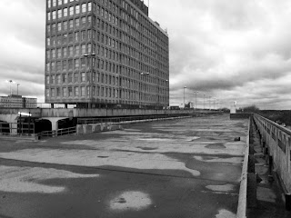
This was my favourite image from the shoot as I believe it is the best representation of a landscape that I took. I also liked how, due to the puddles on the floor, it has created contrasting tones which I manipulated in Photoshop to appear even more contrasting. I did this as high tonal contrast is a clear theme in Ansel Adams work.
This was an image I did not like. I took this image as I was attempting to get a picture of the road. I wanted it to be a clear road and I wanted it to be completely straight across the middle as this would create perfectly horizontal lines. This did not work for two reasons. The first is that I took the image at an angle and so the lines are not horizontal but are slanted, and secondly you can see a car enter the image in the bottom right corner.
Progression
When I next shoot landscape photography, I would try and follow the work of a different photographer such as Stephen Shore as I found it hard to do this with Ansel Adams. This is because I am in an urban landscape whilst Ansel Adams shot images of natural landscapes. I would also try to take more pictures as due to the setting I was in and the weather I was restricted with time and did not manage to take many.


No comments:
Post a Comment