
I like this photograph as when it becomes more focussed towards the right side, the lights appear closer together. The use of this focussing makes the viewer of the image look towards the right more than the left. The mixture of colours make this image more attention-grabbing and draws the viewer in.

This image is quite captivating as it only uses two colours, and they appear much more vibrant against the darker background. Although red and blue are not complimentary colours, they still stand out against each other and gain their own attention. The brightness of the blue make's the whites of the girls eyes appear much brighter.


Both of these images use multiple colours in order to grab attention, but manage to focus the attention in different ways. In the top image, it uses a black background in order to make the colours appear brighter and become the main subject of the image. In the second picture, the yellow flowers and the green stalks have been blurred in editing so that the purple flowers are the main focus. This is also so the focus is on the middle of the image.

I have added this photo to my image bank as it is a good example of use of complimentary colours. Although there is more red than green in this image, this is what makes the green seem brighter and therefore is the bigger subject of the image. I really enjoy the use of complimentary colour in this image as the red leaves seem to act as the background for this image, making the green leaf appear stronger.
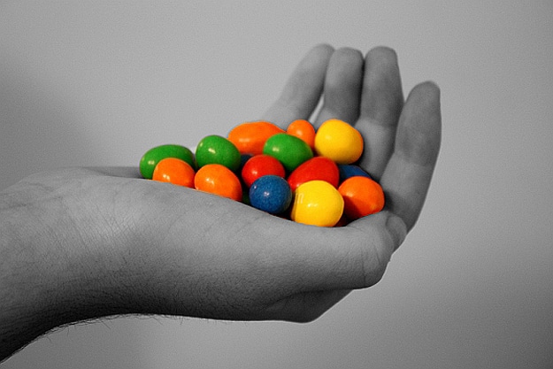
I like how this image has been edited as it uses selective colouring to make the colour of the sewers seem brighter and pop in the picture. The photographer would have selected the background and used a black and white effect on it in order to create this picture. I like how, although only part of the image is in colour, it still includes a range of colour.
No comments:
Post a Comment